Hypothetical brand identity for a contemporary Japanese restaurant designed by Norm Architects. Using a largely monochromatic palette, the architects set out to create a space that respects both Japanese and Scandinavian aesthetics.
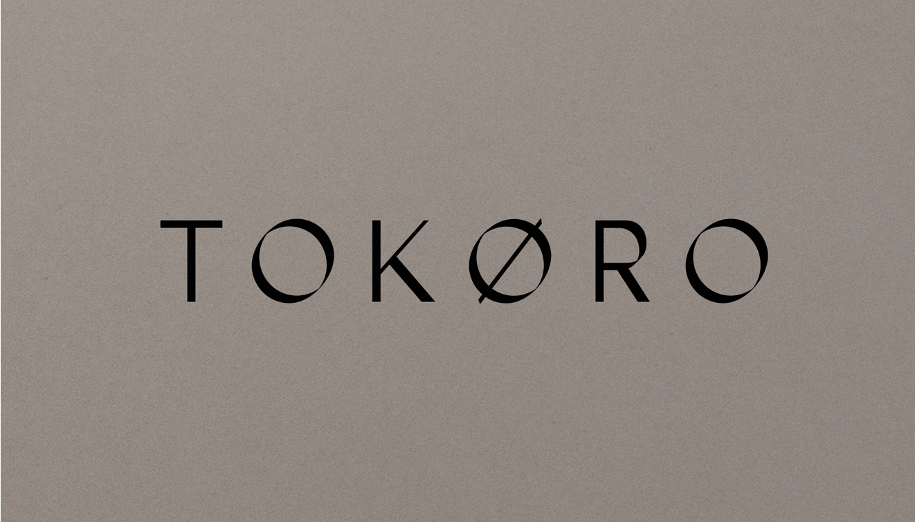
In Japanese, the word tokoro is used to describe the location or site of something, but it can also be used to describe the idea of context. This implies that a place is inevitably connected with all of the activities around it.
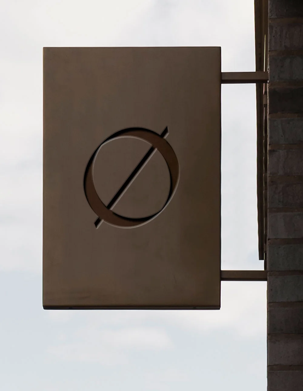
This concept is visually manifested through a dynamic system that speaks to the idea of location and connectivity. It was designed to convey a sense of elegance and modernity, while still maintaining the timelessness of Japanese calligraphy and penmanship.
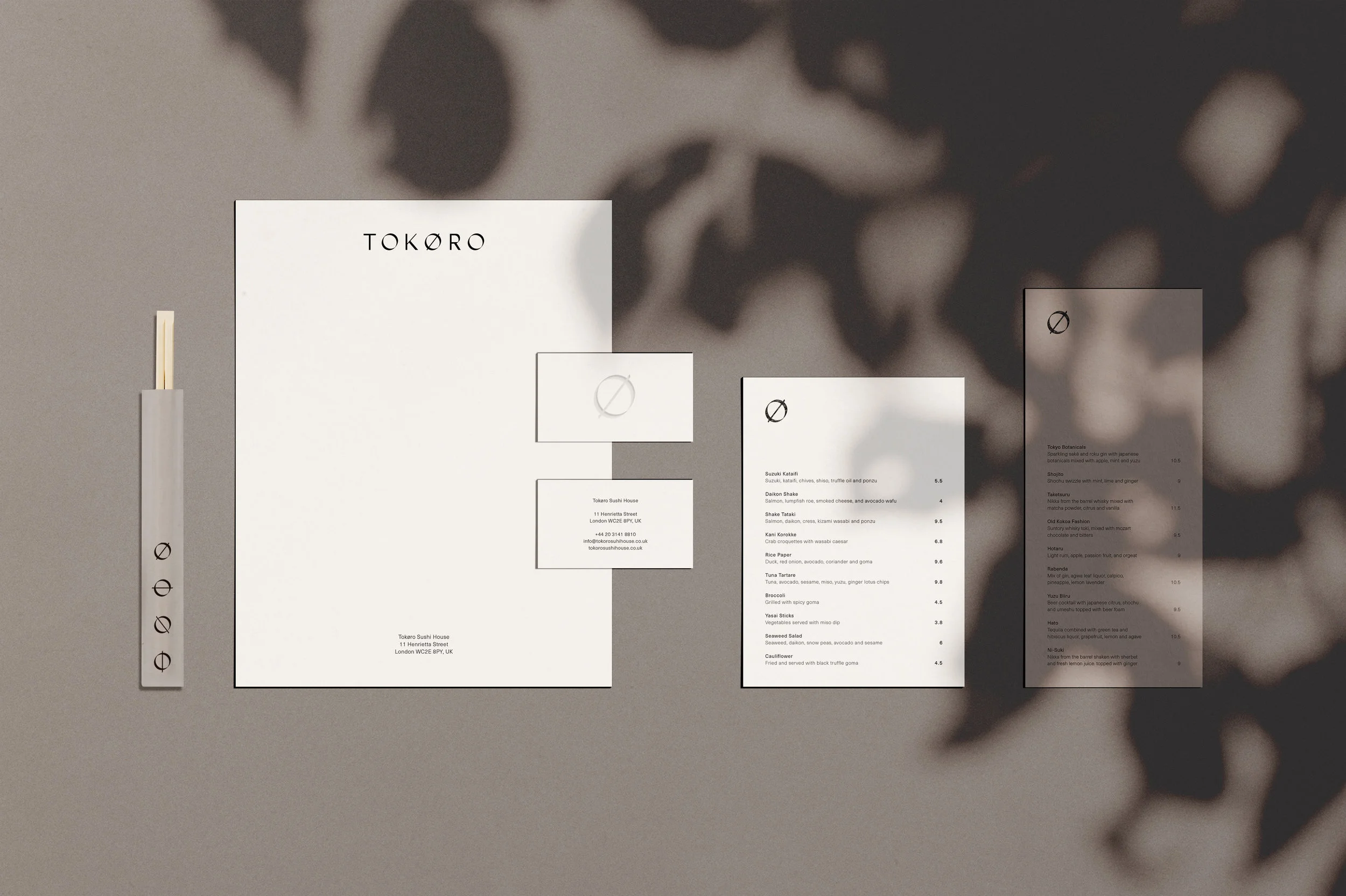
Brand Identity
Menu Design
Collateral Design
Signage